Product
Faster Dashboards, Smarter Heatmaps, and the Start of Experimentation

The last post's "What's Next" section mentioned a major upgrade to our web analytics engine. It shipped. The dashboard is dramatically faster, with realtime visitor tracking and a unified filter bar that applies across every metric. We also rethought how drill-down works so you can go from a top-level number to a detailed breakdown in one click.
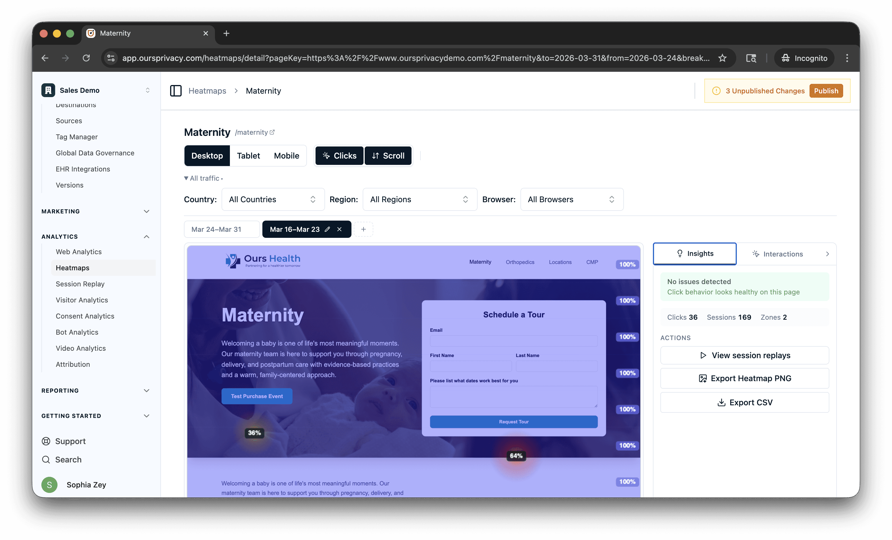
That same energy went into heatmaps. Instead of looking at one snapshot and guessing whether things improved, you can now compare heatmaps across time periods side by side. The system surfaces insights automatically, flagging pages with high rage click and dead click rates so you're not scanning every page hoping to spot a problem.
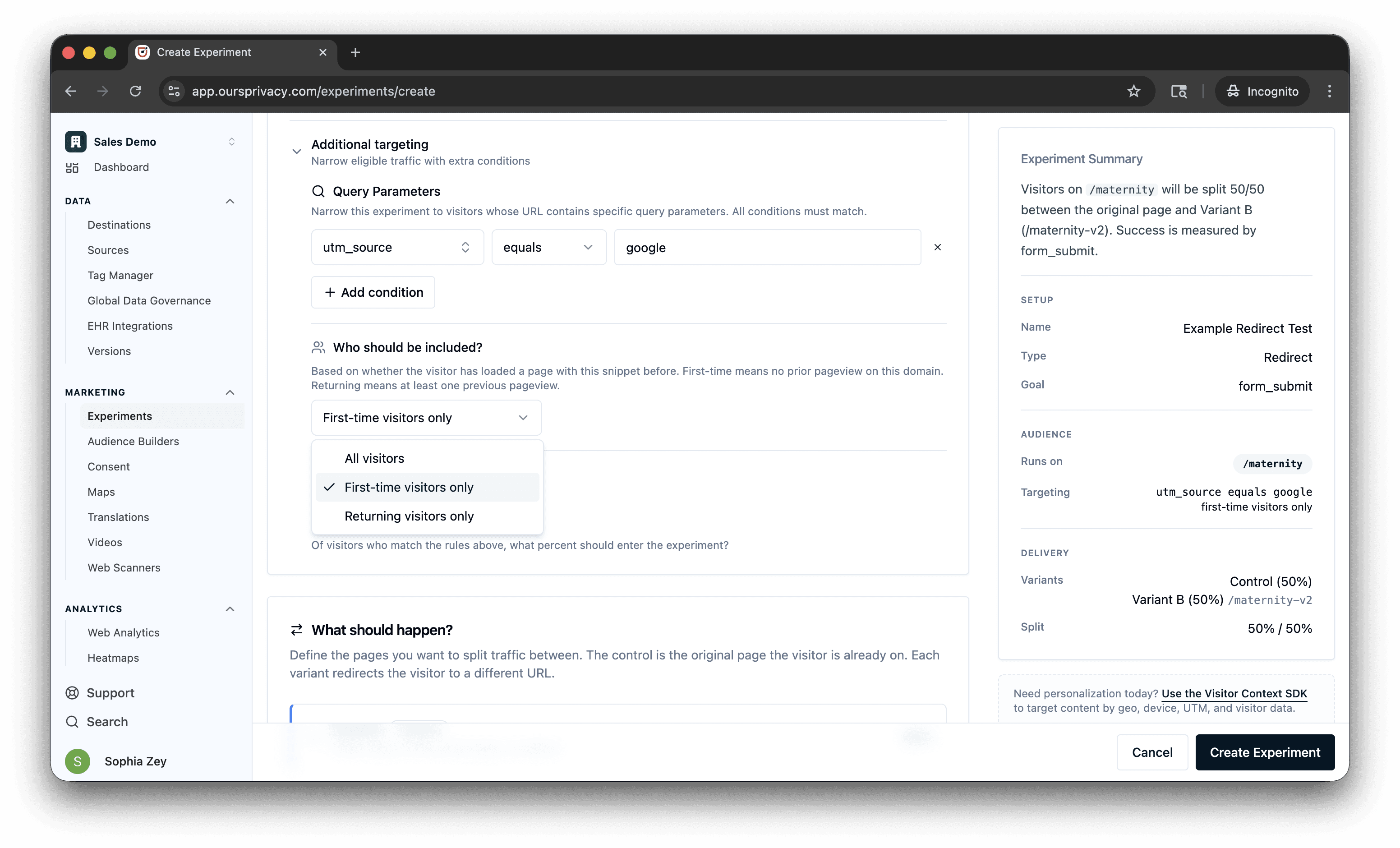
We also shipped the first pieces of our experimentation product: audience targeting by UTM parameters and visitor type, plus a Personalization SDK that gives your code access to visitor context (device, geo, referrer, time) without a backend integration.
Here's what's new:
Web Analytics Dashboard
The analytics dashboard is significantly faster. Same metrics you already use (unique visitors, total visits, pageviews, views per visit, bounce rate, visit duration), but page loads are dramatically quicker, especially on accounts with high event volume.
What's new:
Faster queries across the board. The dashboard loads faster and stays responsive as you filter, drill down, and switch date ranges.
Realtime mode shows active visitors with 30-second refresh intervals. Toggle it on from the toolbar to see who's on your site right now.
Unified filter bar lets you filter across all dimensions (source, medium, campaign, page, country, device, browser, OS) from one place. Filters apply globally across every section of the dashboard.
Metric comparison compares the current period against the previous period with delta indicators on every metric card.
Drill-down drawers on every breakdown table. Click a source, page, or country row to open a detail view with deeper analysis.
Interval controls let you toggle between minute, day, week, and month granularity on the time-series chart.
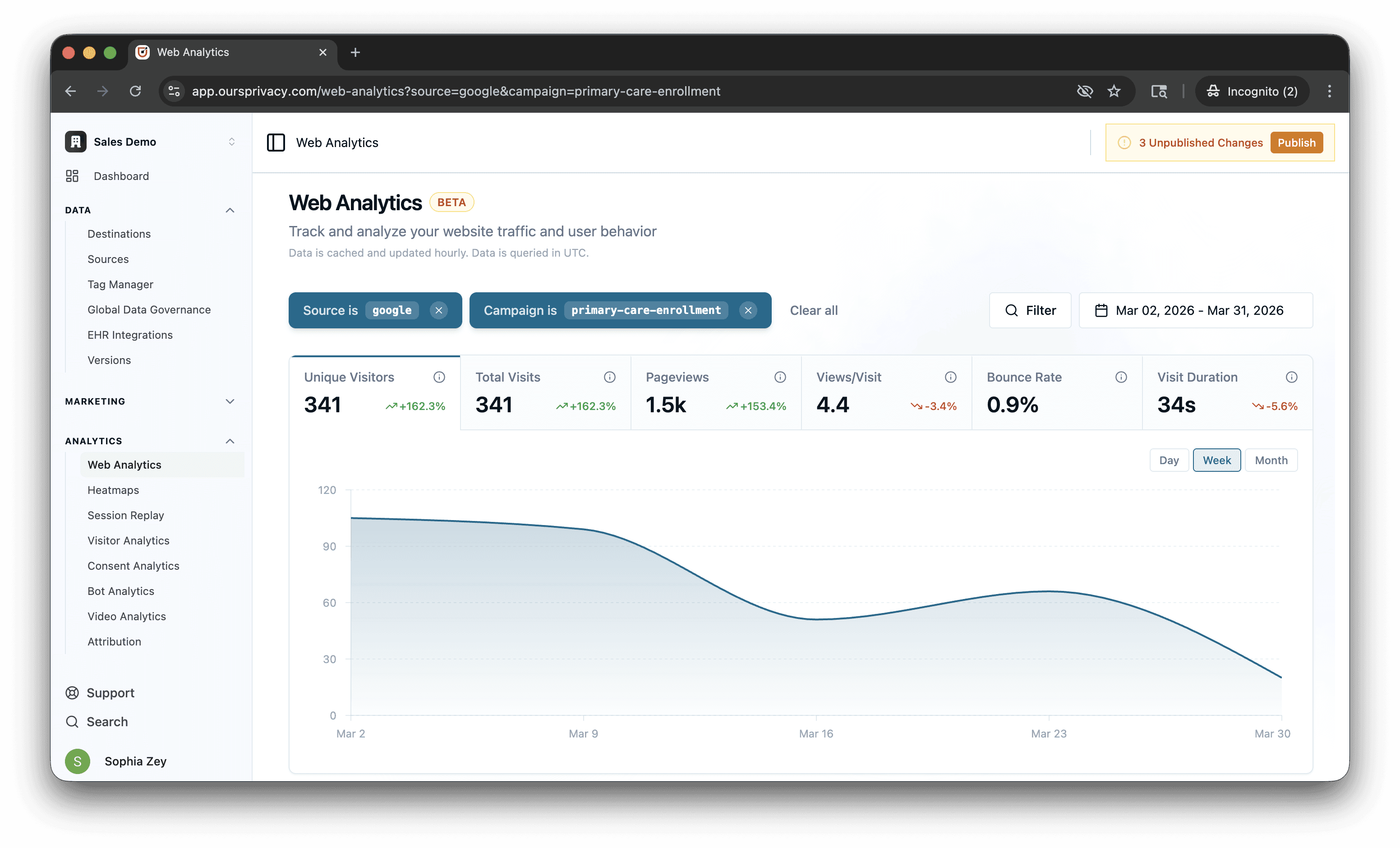
Changing a filter updates every section at once. No more waiting for individual panels to reload separately.
For setup and usage details, see our web analytics documentation.
Heatmap Comparison and Automatic Insights
Most heatmap tools show you a single snapshot. You see where people clicked last week, but you have no way to tell if that's better or worse than the week before. You're looking at a photo when you need a diff.
We built comparison into the core workflow. View up to five heatmap snapshots side by side, each with its own date range. The comparison summary shows deltas for total clicks, rage clicks, and dead clicks between periods. Color-coded indicators (green for improvement, red for degradation) make trends obvious at a glance. Quick presets like "Previous period" auto-calculate the comparison range so you don't have to do the math.
Automatic insights surface the pages that need attention. The system scores pages based on rage click and dead click rates, flagging critical and warning levels so you can prioritize which ones to investigate first.
Instead of reviewing every page hoping to spot a problem, the system tells you where to look. Redesign a page, take a new snapshot, compare it against the previous period, and see whether rage clicks dropped. That's the workflow: change, measure, compare.
Element click attribution is smarter too. When a visitor clicks a child element inside a button or link, the system traces up to the interactive ancestor and attributes the click correctly. The Top Elements card filters out generic containers and shows meaningful elements (buttons, links, inputs) with human-readable labels.
For setup and usage details, see our heatmaps documentation.
Experimentation: Targeting, Redirects, and Personalization SDK
Our experimentation product keeps growing. Here's what you can do with it today. These features are in private beta. Request access if you'd like to try them.
Redirect experiments let you split traffic between different URLs. Send 50% of visitors to your current landing page and 50% to a redesigned version, then measure which one converts. The redirect happens before the page renders, so visitors never see a flash of the wrong page. Use it for full-page redesigns, different landing page layouts, or testing entirely different flows.
You can target who enters an experiment before they're assigned. Filter by UTM parameters, query parameters, campaign, source, medium, or any custom value. Target first-time visitors separately from returning ones. All targeting is evaluated before the page renders, so the right audience sees the right experience from the start.
Personalization SDK gives your frontend code access to visitor context without a backend integration. The SDK knows who the visitor is (new or returning), how they got there (UTM, referrer, query params), what device they're on (type, OS, browser, screen size, language), where they are (country, region, city, postal code, coordinates), and when they're visiting (day of week, hour, timezone). Your code can use all of that to personalize content, conditionally show elements, or feed targeting logic without waiting for a server round-trip.
Everything Else
Consent banner accessibility: We built guardrails into the banner design editor to help you meet accessibility best practices. If you pick a color combination that doesn't meet contrast thresholds, the editor warns you before you publish. Our default styles are built with accessibility in mind.
Funnels: Better filtering, stability improvements, and you can now export any funnel as a branded PDF. Share it with stakeholders who don't have platform access or attach it to a monthly report.
Maps: Location pins now support phone number, website URL, and custom link text fields. Phone numbers render as tap-to-call on mobile. Makes location pages more useful as standalone directory listings.
What's Next
The speed improvements you see on the analytics dashboard are rolling out across every query surface in the platform. Heatmaps, session replay filters, and data governance reports will all get the same treatment over the coming weeks.
Experimentation is expanding. The targeting rules shipped here are the foundation for more complex audience segmentation, including behavioral targeting based on past events and traits accumulated over time.
The heatmap snapshot comparison opens up a workflow we've wanted for a while: before/after analysis tied to specific changes. We're building toward linking snapshots to deployment events so you can see exactly how a release affected user behavior on a page.
For setup and technical details, see our documentation.
Want to see any of this in action? Book a demo.
Related Articles
Newsletter
Stay up to date
Subscribe for privacy news, feature updates, events, etc.
